Mag ik:
(3 votes)
Denn is de maakt wurrn:
2026
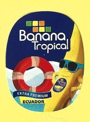
Wo de her kummt:
- Ecuador
Materiaal:
- Ut Papier
Farv:
- Witt, Bruun, Rood, Geelrood, Geel, Gröön, Blau
Förm:
- Oval: Twasch röver mit Kurven
Breed:
22
Hoog:
28
Dat Thema:
- Banana Figure, Banderole
Het wat opdruckt:
Banana Tropical
Extra Premium
Ecuador
Steiht in den Kataloog:
- T›Tropical›Tropical: Banana Tropical›Banana Tropical: Set›Banana Tropical: 2026 - Summer
Post date:
Apr 2026
Last modified:
Apr 2026
Comments
Very nice work, Pietro. This
Very nice work, Pietro. This scan now follows our catalog standard: yellow background, 300 dpi, correct size (300 × 405 px) and straight aligned.
I am curious: does this scanning take you more time than before? And what was the hardest part to learn?
It's always a good pastime
It's always a good pastime and fun. I hope the photos aren't replaced with those with reddish backgrounds, which I don't like very much.
I assume you are referring to
I assume you are referring to my scans when mentioning the reddish backgrounds. If so, you are right - the color tone has changed quite a bit over the years. It has gradually become darker, even though I have been buying the same paper from RÖSSLER for many years. I agree that it is now a bit too dark.
In the past, I often replaced images when a new scan did not match the existing size within a catalog entry. It was important to me that labels can be compared using the “flip” function, which only works properly if they are exactly the same size. The labels also look a bit unharmonious and untidy when displayed side by side in different sizes.
I will probably be able to stop replacing images in the future, which will save me quite a bit of time. So thank you very much for the effort you put into improving your scanning technique so that it now fits well with the overall appearance of the catalog.